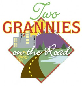
The Two Grannies’ Logo!
 Someone asked me the other day what the process was in creating the logo for Two Grannies on the Road. Well I thought it would be easy since I am one of the people creating this business.
But that was not to be.
I truly struggled with the completion of this logo. First I had an idea of using a rear view mirror with a reflection of what we might see. Or a reflection of a road on which we were driving. I tried having silly things hanging from the mirror like we used to do when we were teenagers. I just could not get it to translate into what I wanted.
Then I tried using a steering wheel but it simply came out looking “hokey”.
Then I started to think of the kinds of places through which we might be driving. We will be coming from the Atlantic Ocean end of the country and going through some big cities and on toward some mountainous areas. We will be seeing grains of wheat waving in the wind and ponds and trees and . . .
So that was my inspiration. I wanted it to be less formal and more friendly. So using color was definitely in order. Using two different fonts made it seem more whimsical as did the choice of fonts. A casual script was needed rather than a formal one and the font for the word Grannies had many changes until I found the one I finally chose. And the stylized roadway is being used in different places on our marketing meterials.
Creating logos for companies is one of my favorite things to do as a Graphic Designer. Doing one for myself is far more difficult than I remembered. But I am pleased with the result and I hope people who see it agree . . . at least a little.
Ginny . . .the older, funner, more adventurous Granny

Comments
The Two Grannies’ Logo! — No Comments
HTML tags allowed in your comment: <a href="" title=""> <abbr title=""> <acronym title=""> <b> <blockquote cite=""> <cite> <code> <del datetime=""> <em> <i> <q cite=""> <s> <strike> <strong>